welcome to lun-ish.
My name is Madeline Liao, I'm a visual and written communication specialist with skills in graphic design, editing and copywriting.In my work, I merge thoughtfulness with authenticity, designing with heart. I take into account as many perspectives and details as I can, seeing things others might miss.lun-ish is a manifestation of my work in creating authentic and effective stories that resonate with audiences.

my work →
Editorial Layout & Typesetting
Concept Creation
歡迎到 lun-ish。
中文版正在準備中!

I am a designer with a passion for tangibility and accessibility. I have a fondness for print design, creating layouts and emphasizing effective communication that can reach people of all abilities.lun-ish is a representation of my heritage, coming from a character in my Chinese name, "lun"(綸).
experience & education
I'm currently a communications assistant for the Disability Foundation. I was previously an online editor and arts & culture editor at The Eyeopener. I was also an art and editoral intern at Broadview. I have also worked as a copy editor for the student publication StyleCircle and as a graphic designer for CanCulture Magazine. I attended Toronto Metropolitan University’s School of Journalism and am currently completing my graphic design certificate at British Columbia Institute of Technology.Having worked in both the editorial and design aspects of journalism, I have first-hand experience of the different pieces that make up the puzzle that is a publication.In 2022, I received the award for Written Word: Feature Story from the Emerge Media Awards for my feature on racialized students’ mental health. I also received the Albert E. Wadham Award from Toronto Metropolitan University’s School of Journalism in 2022 and the Caren King Scholarship in 2023.
selected writing
magazine and newspaper articles
This Vancouver bookstore is more than a business — it’s a platform for justice - Broadview MagazineM.G. Vassanji explores what it means to belong in his new essay collection - Broadview MagazineHome Away from Home - Broadview MagazineThe Spectrum is Wide - The OtterMaxine Green – Empowering Black Female Entrepreneurs - Black Fashion Canada DatabaseFilm is not dead: The prevalence of analog photography – CanCulture MagazineArtspace TMU showcases Black creativity in research residency – The EyeopenerPicture perfect: Editor’s picks from TIFF 2022 – The EyeopenerHome is where the heart is, but where is the heart? – New Wave Zine‘I’m not broken’: Racialized students on navigating mental health in their communities – The EyeopenerThe hope of Toronto's Chinatown: Cultural rejuvenation through artistic expression – T-Dot
editorial
The Travel Issue – Fall 2022 arts & culture special issue of The Eyeopener
As managing editor of this issue, I curated pitches, assigned stories to writers, edited stories, conceptualized the overall style of the microsite and printed pape, as well as formatted pages for print.
selected design works
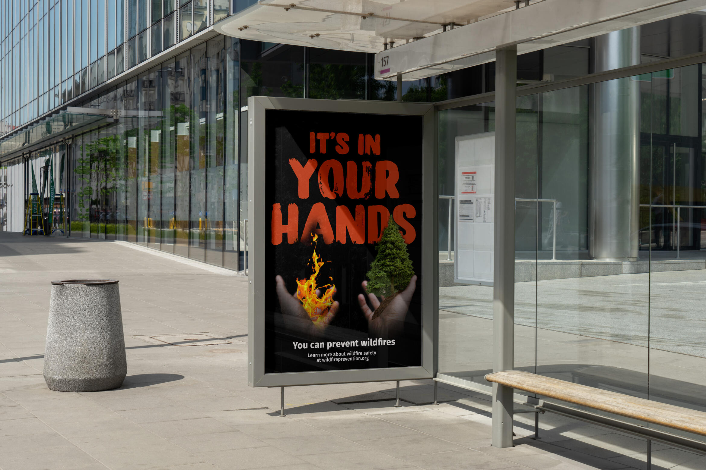
it's in your hands: wildfire awareness campaign
By Madeline Liao, Mel Zaini, Gael Lacar, Jenny Yu
A social awareness campaign regarding wildfires in British Columbia
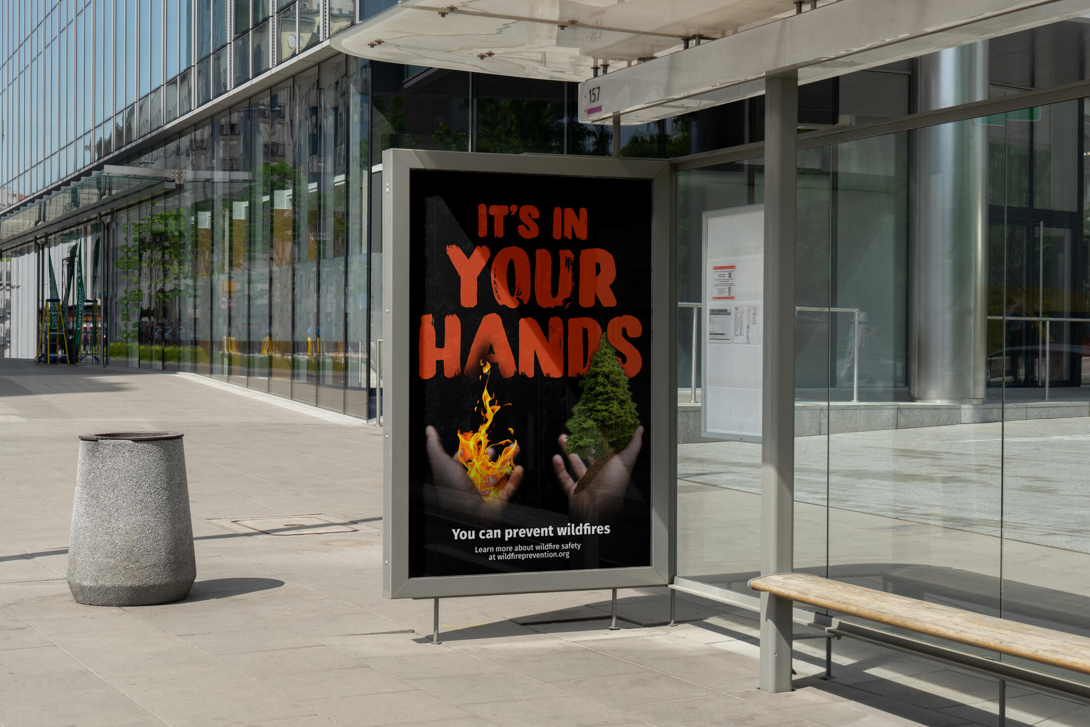
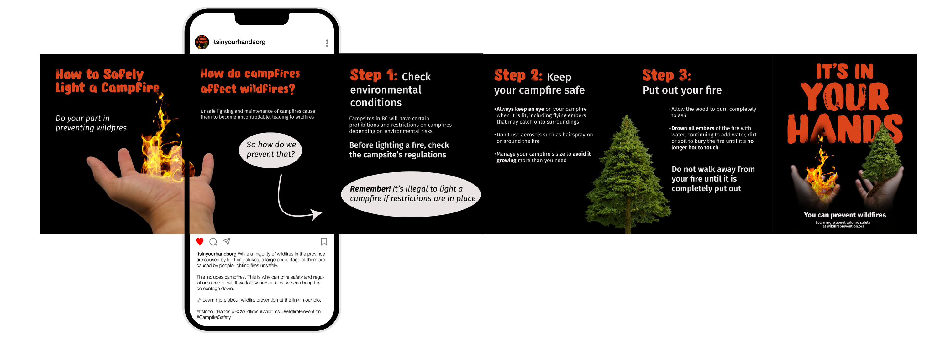
Three of my classmates and I were tasked with creating a cohesive visual campaign for a prevalent social or environmental issue. We decided to create an awareness campaign surrounding wildfire safety and the issue of wildfires in British Columbia.
the campaign
Targeting families with children within Gen Z and early Gen Alpha, we focused on short, attention-grabbing content that showcased the issue and solutions.Our campaign’s theme focused on safely lighting campfires, employing a hopeful message and telling audiences that there are solutions to the problem that are achievable from the ground.Rather than just push the issue, we wanted to offer a way for the audience to make a difference and impact the cause.
my role
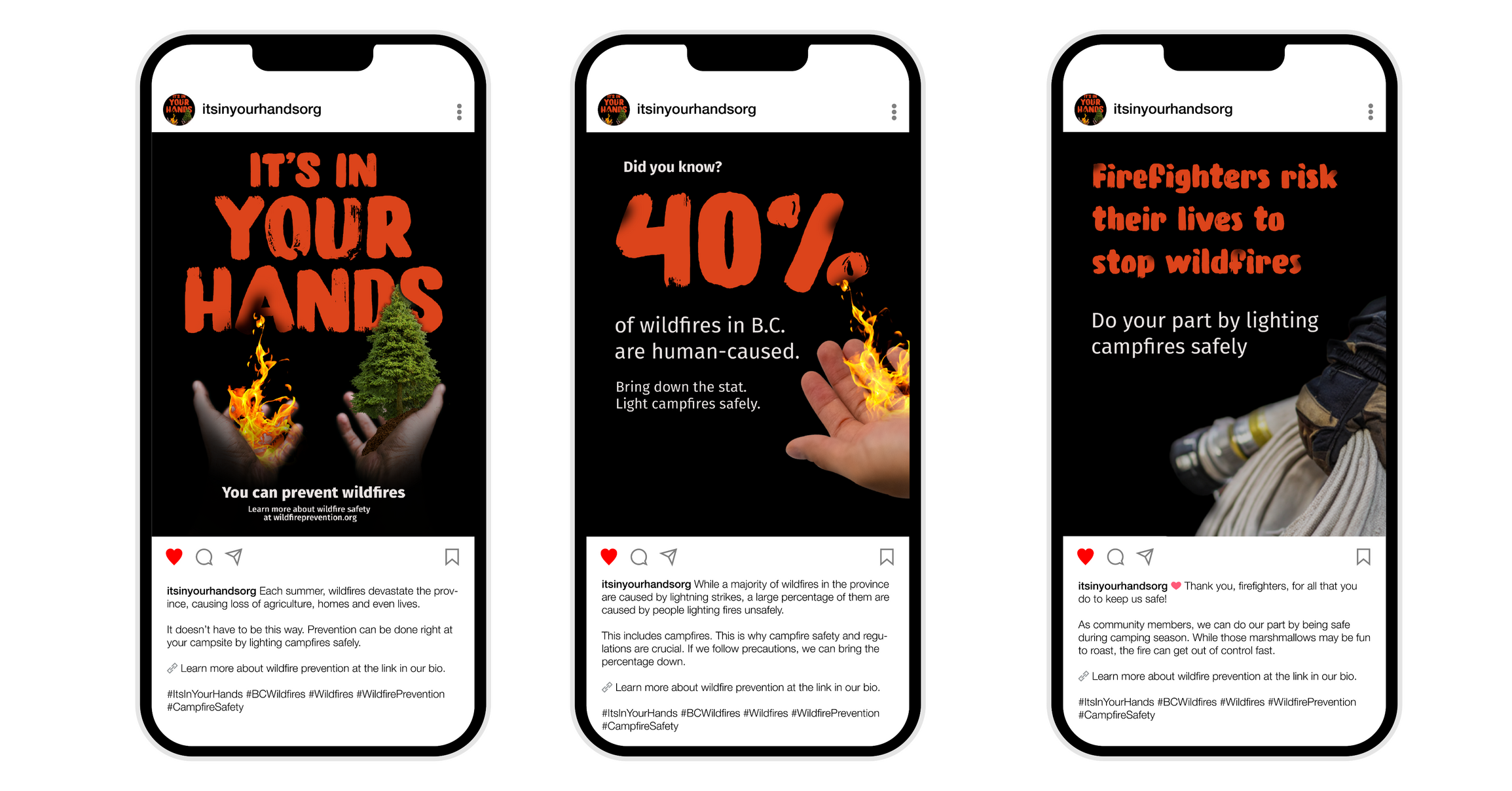
My main role in this project was to create eye-catching and informative social media posts that fit within the campaign's visual language.I also assisted with initial research, writing copy for the campaign and Photoshopping visual elements.
design choices
The message of our campaign puts the responsibility in the viewer’s hands, which we accomplished through the use of a point-of-view composition.All titles have a “singeing” effect, mimicking the fire burning the text, tying together our visuals for different mediums and alluding to the power of wildfires.Also, all visuals incorporate hands in some way to emphasize our slogan, “It’s In Your Hands.” Whether it is a hand holding fire, trees or a firefighter’s hand holding a hose, the hands tie together the campaign.
what i learned
This project helped me to expand my collaboration skills. Working in a group rather than on my own designs, I was able to figure out how to design in a way that fit our collective style and create a visually-cohesive campaign.
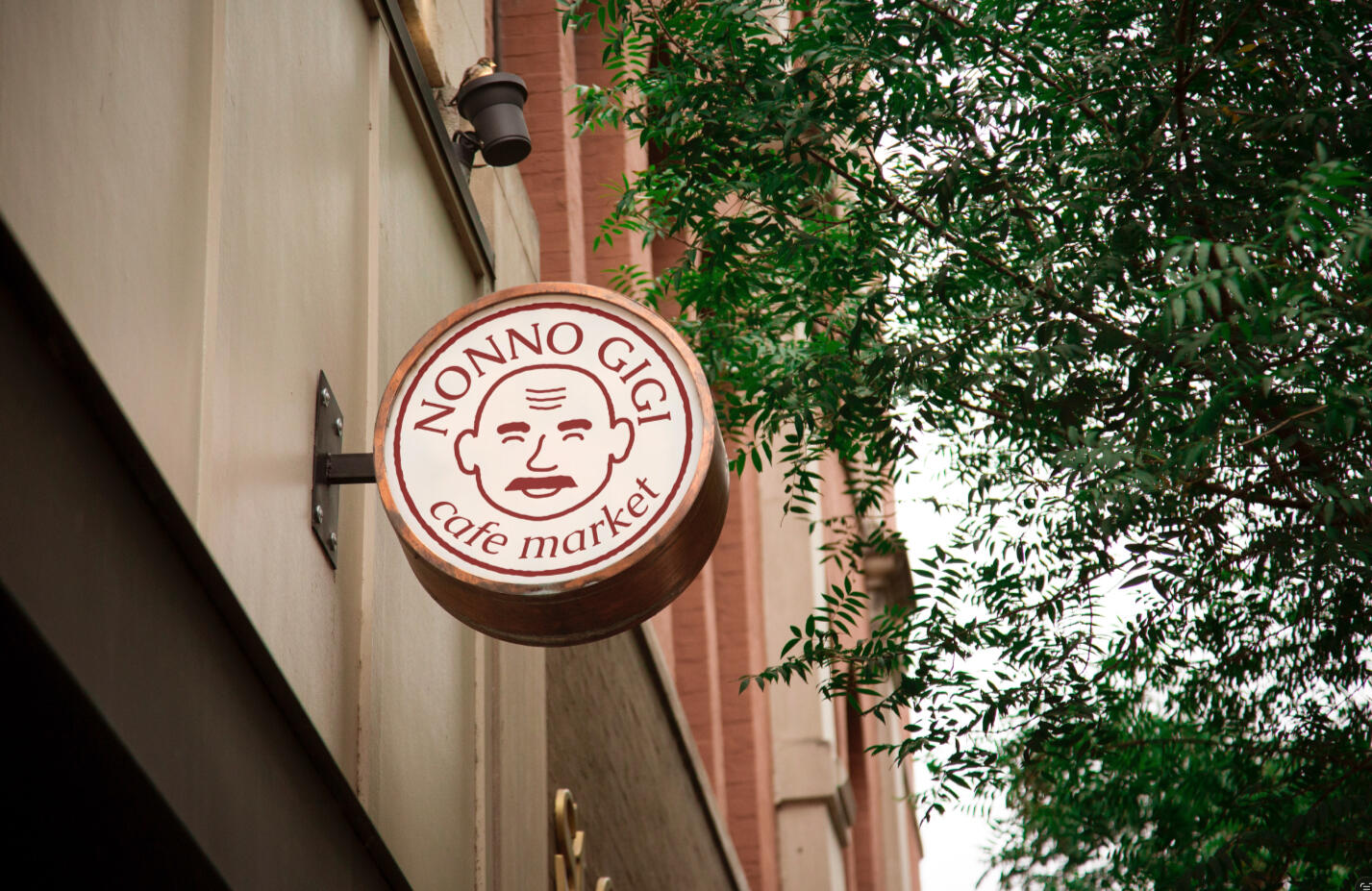
nonno gigi: business branding
By Madeline Liao
A comprehensive branding exercise for a local cafe
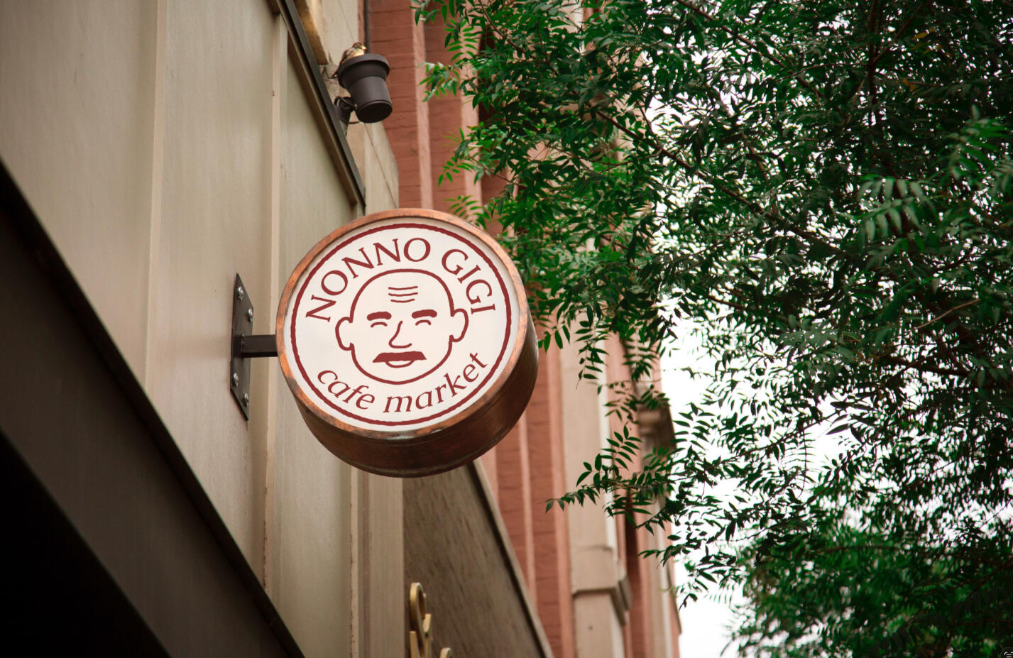
For this school project, I was tasked with selecting a local business and designing my own take on its brand identity.In this comprehensive branding exercise, I reinvented a business from the top down. Beginning with a deep analysis of the business and its customer, I used market research to create a voice and visual identity that suited the brand.


the brand
All brand assets for Nonno Gigi utilize hand-drawn illustrations with rough edges to emulate the cafe's heritage and down-to-earth personality. Utilizing a colour palette that pays homage to the owner's roots and typography with humanist features, the brand comes together to represent the business's place in the community as a locally-owned coffee shop.Nonno Gigi logo design commemorates the namesake of the business by making him the centre of the emblem. The circle surrounding him is a representation of the cafe staff's unity, as well as the continous flow of customer interactions as the business gets to know the community.
what i learned
This project allowed me to understand the process of creating a brand identity for a business. I was able to gain experience in research, drafting and logo design.
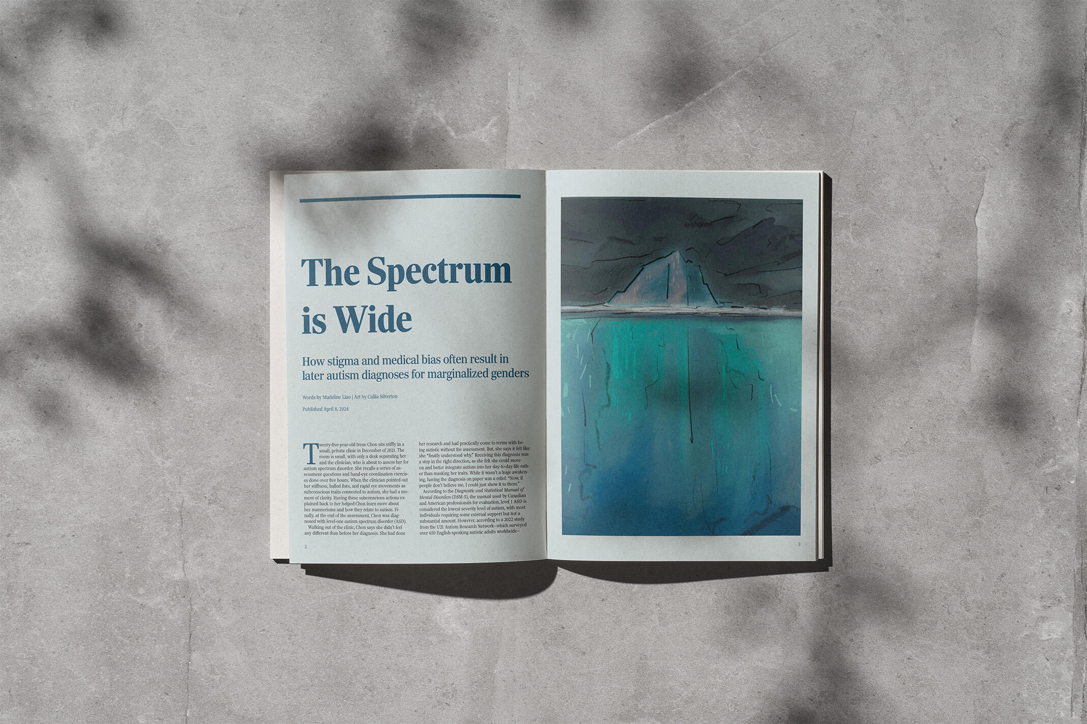
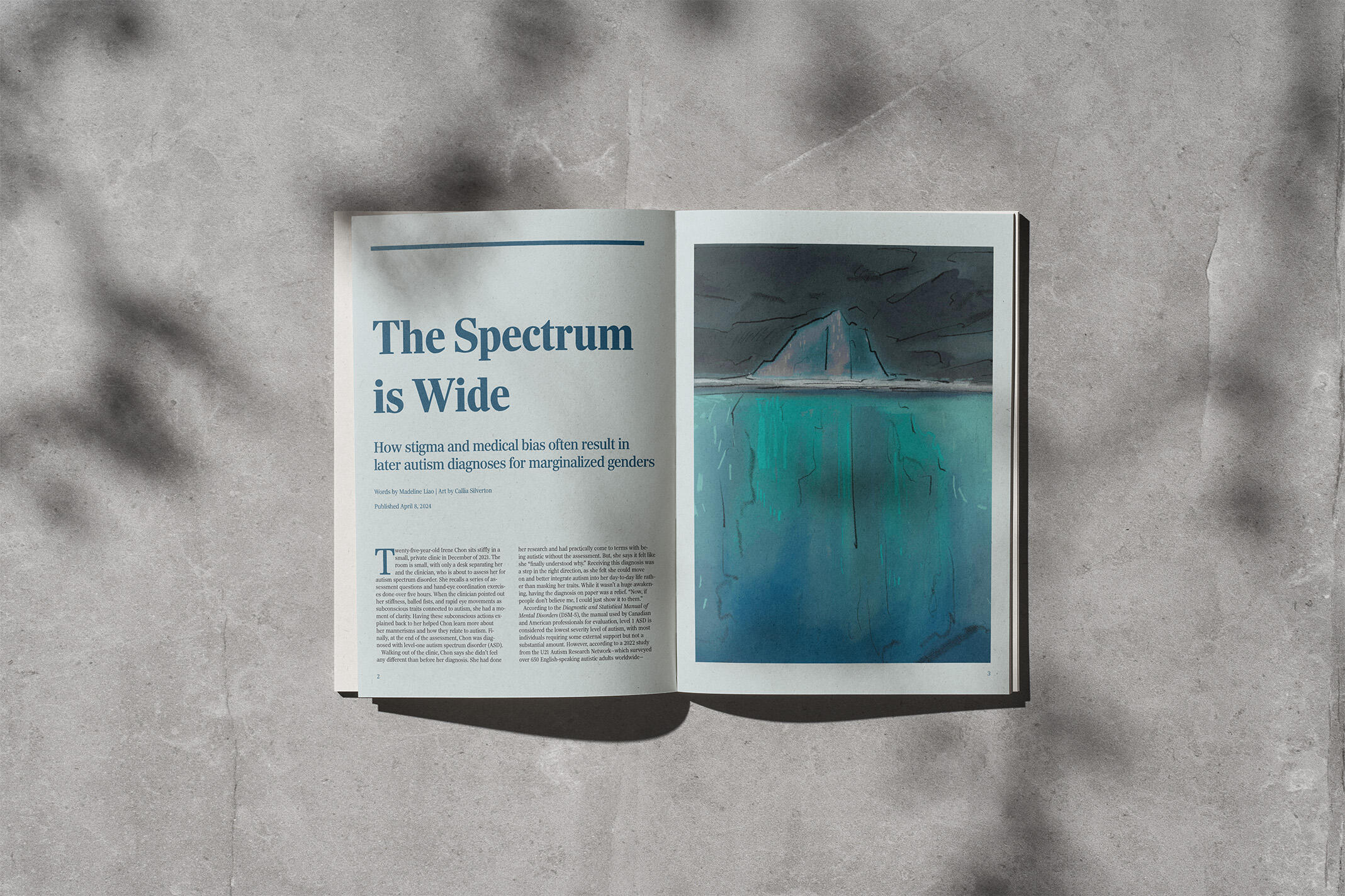
the spectrum is wide:
editorial layout
By Madeline Liao
A carefully typeset magazine layout that showcases attention to detail.
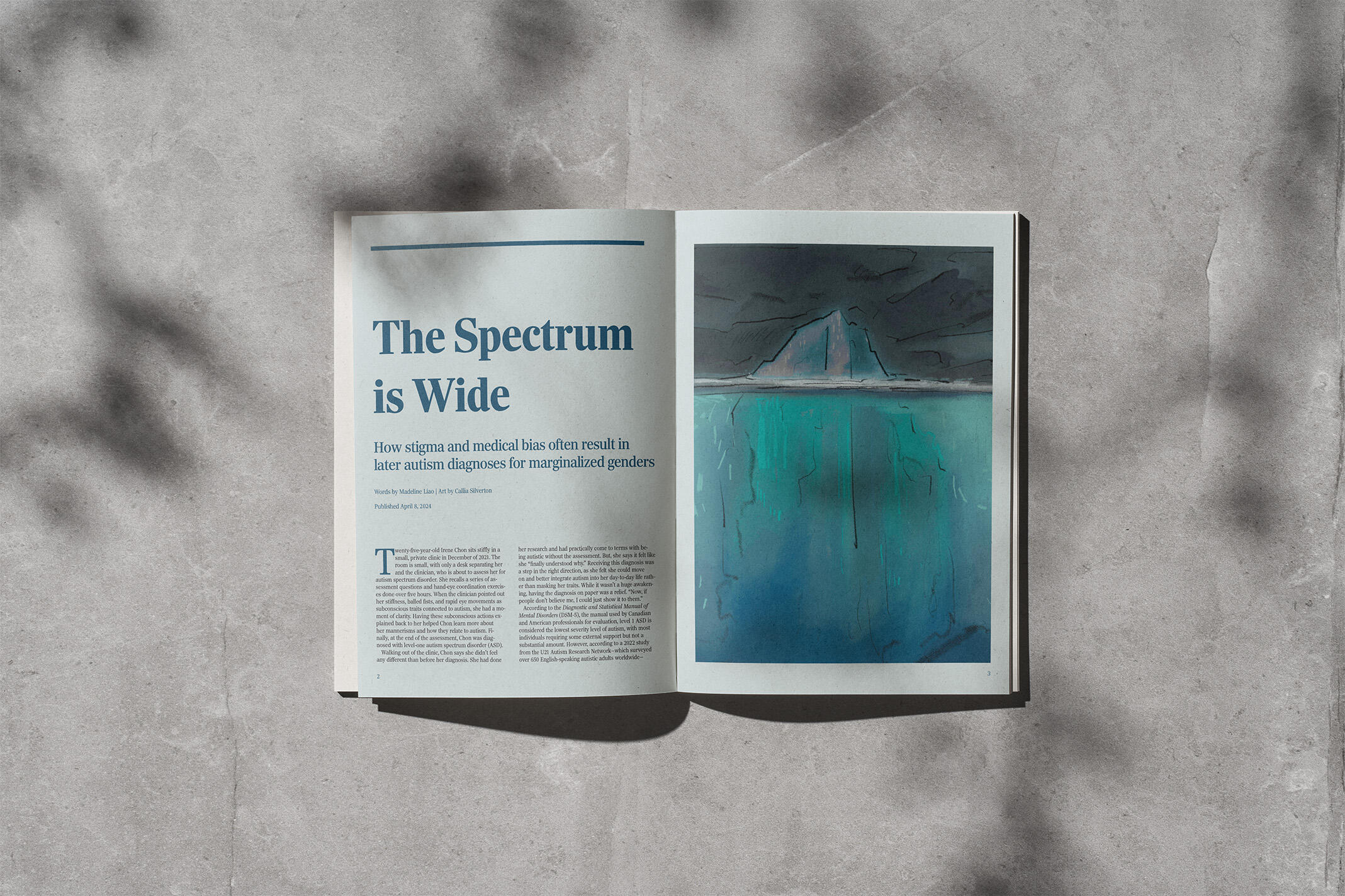
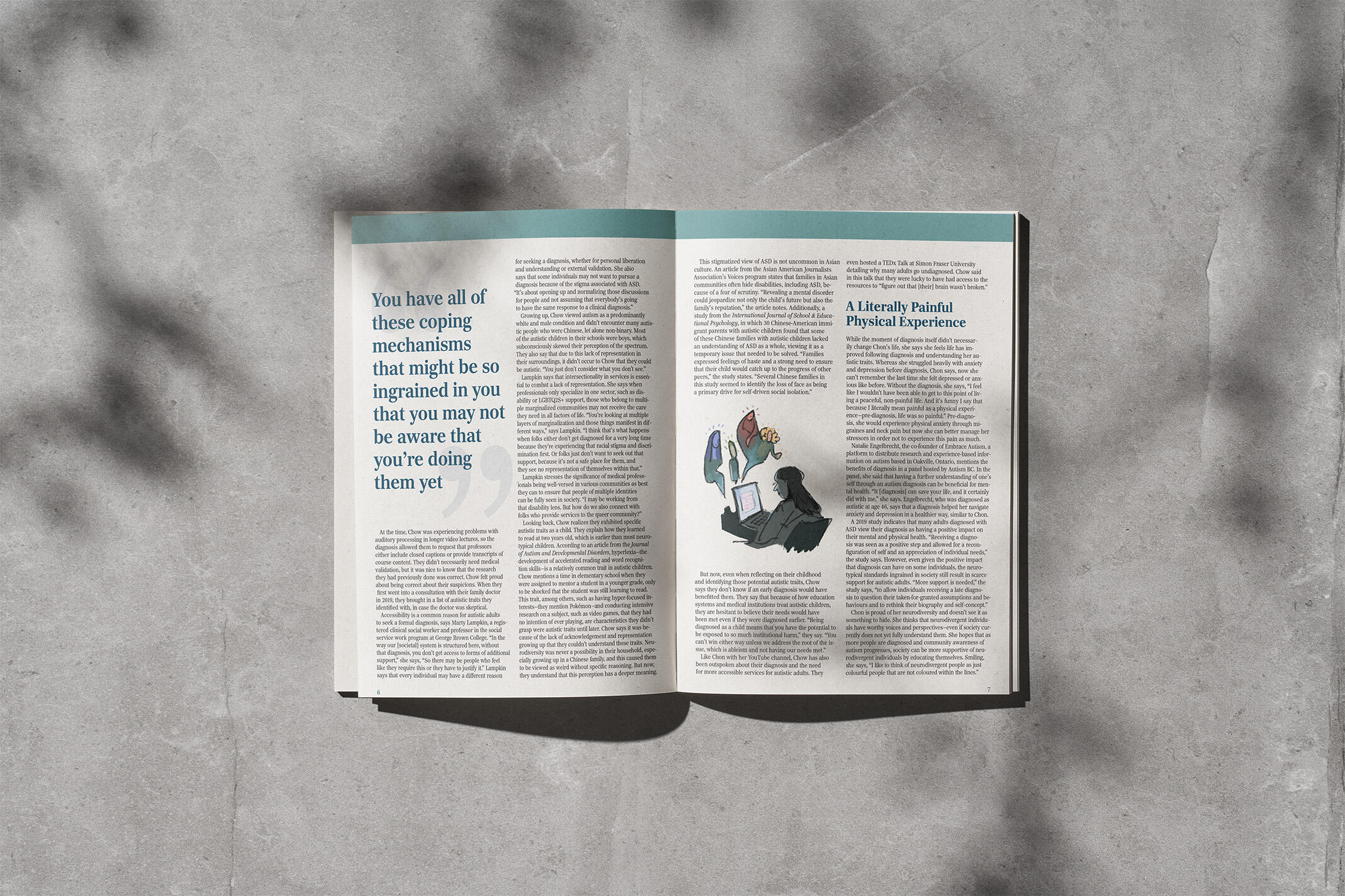
This project involved creating an editorial layout for a long-form article, prioritizing readability. The task was to choose a typeface suitable for reading long passages of text, as well as finding ways to break up the copy so it could be easily digested and visually-pleasing.
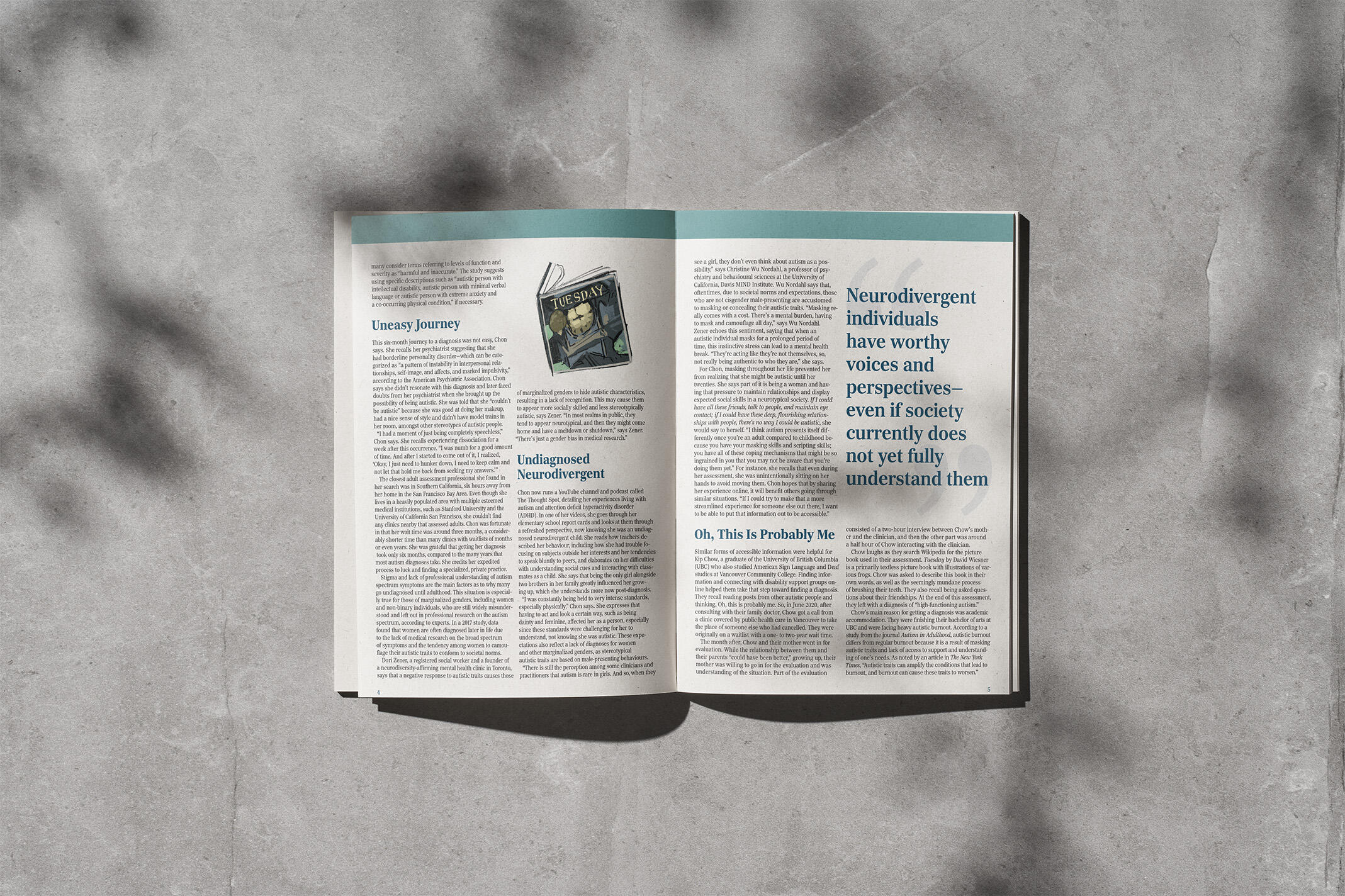
design choices
I chose Richmond Text, a serif typeface that helps to guide the reader along each word. Each section is broken up with headings, pull quotes and images to avoid long blocks of text.After laying out the text, I adjusted each paragraph to account for leading, kerning and paragraph rags.
what i learned
This project allowed me to exercise my skills in typesetting, taking into account every letter on the page and making sure every element works together and makes sense for the reader.
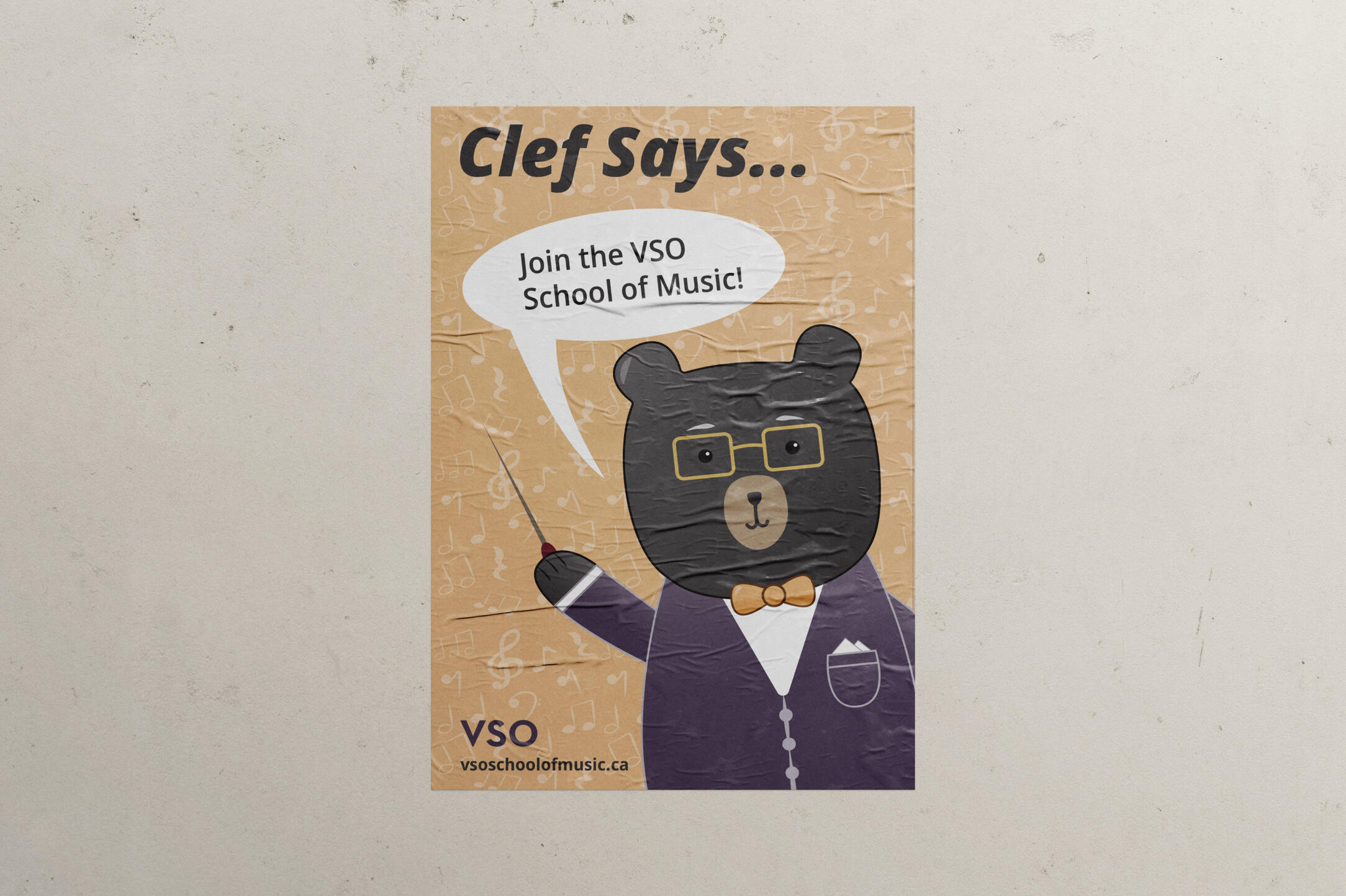
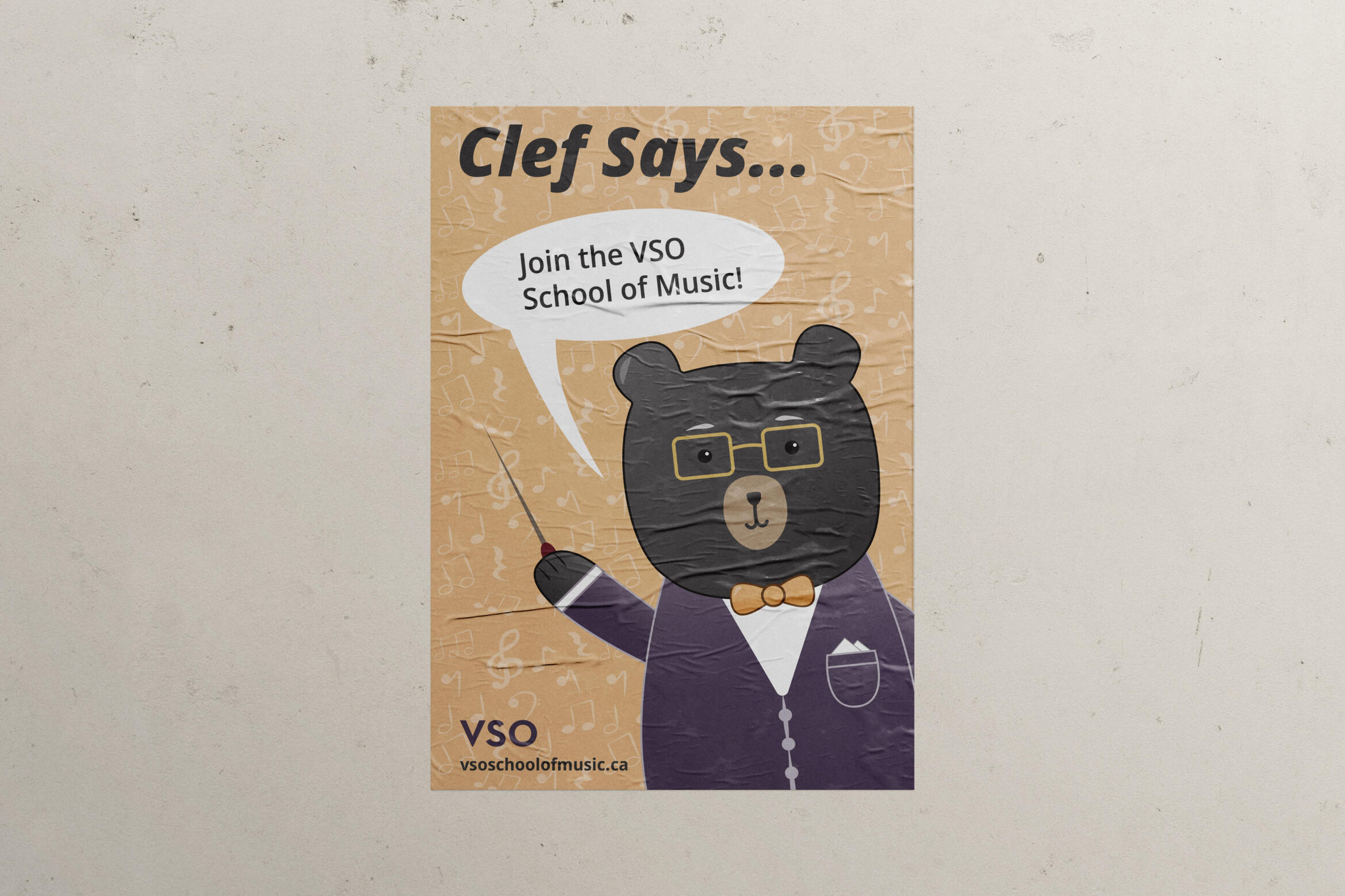
clef the conductor: mascot concept
By Madeline Liao
A conceptualized mascot for the Vancouver Symphony Orchestra's School of Music
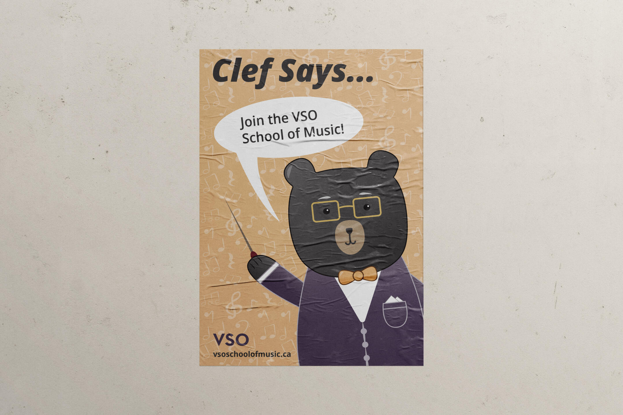
This school project involved creating a mascot for an existing organization, taking into account the organization's values, branding and services.
Representing the Vancouver Symphony Orchestra’s School of Music, Clef the Conductor is a
black bear symbolizing the musicians, instructors and leaders of the institution.A black bear was chosen as the representative animal due to its population in the Vancouver area and wider British Columbia. The black bear is a prominent animal in the area. Compared to grizzly bears, the black bear is known to be less aggressive, which is why it was chosen over a grizzly.By making Clef a more “cartoonish” version of a real black bear, with
less realistic and cuter characteristics, the goal is for him to be inviting and friendly to attract younger musicians to join the school.

design choices
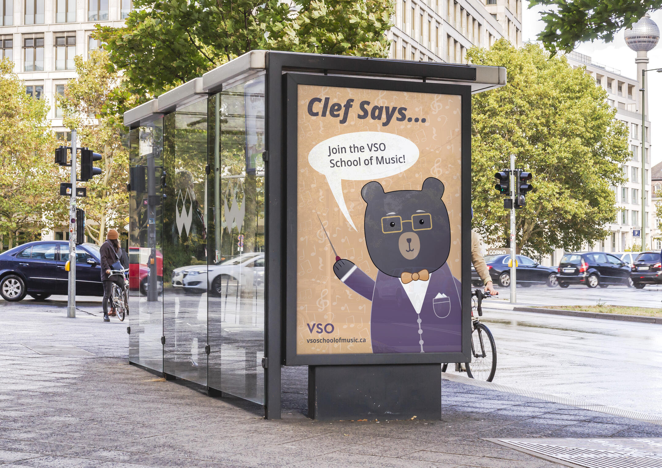
A clash colour scheme of dark violet and a lighter orange was selected due to their symbolism
of creativity and imagination.The dark violet of Clef’s suit as the dominant colour represents his authority and status as
a conductor—the leader of the orchestra. Making it a shade of violet creates a sense of
sophistication and education that is associated with classical music.Paired with an orange tint for the bow-tie and poster background, which represents youthfulness, the poster and Clef become more friendly and social—hopefully inviting viewers to look into and join the VSO School of Music.
what i learned
This project expanded my illustration and concept development skills. I was able to take the characteristics of an existing organization and expand on them to create a personification of their brand. I was also able to utilize my colour psychology knowledge to choose a suitable colour palette for the design.
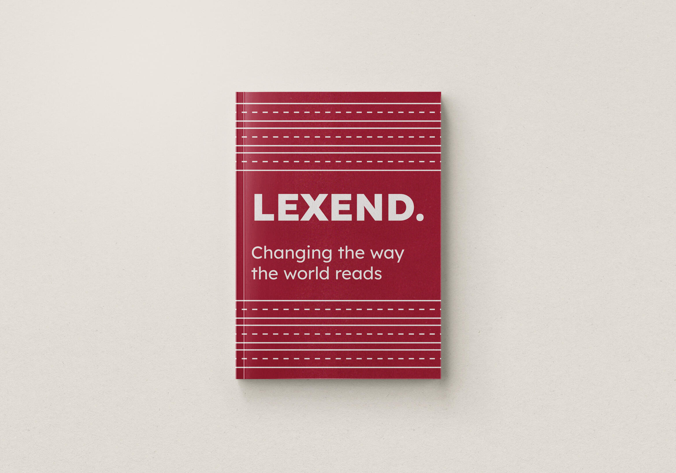
lexend type specimen
By Madeline Liao
A comprehensive guide into the anatomy of the typeface Lexend
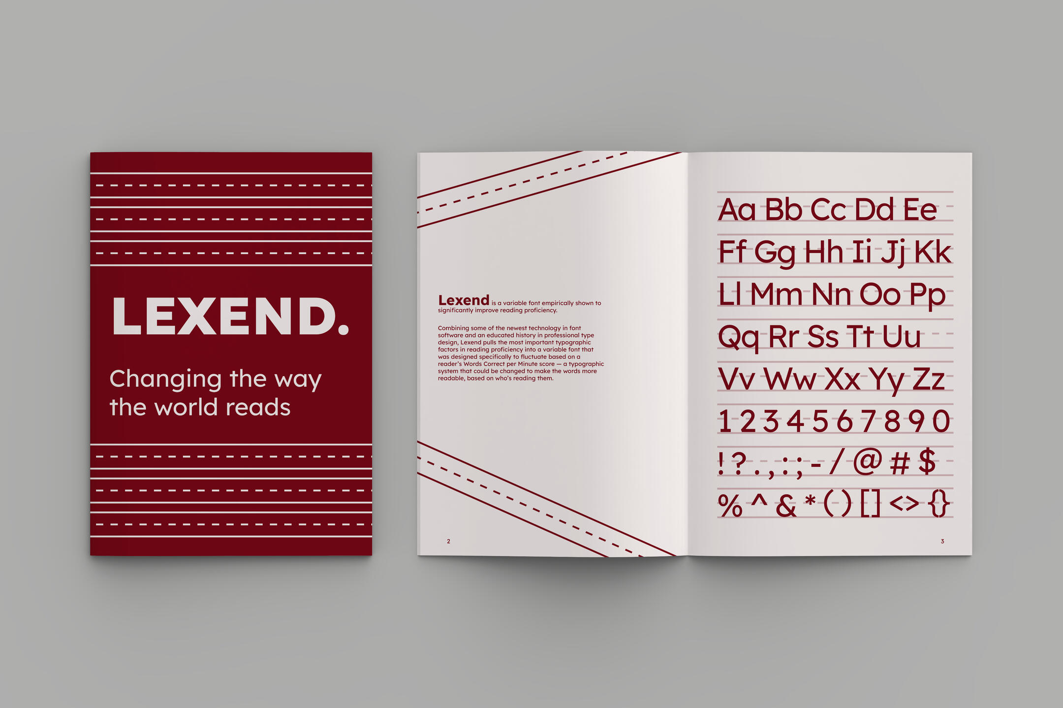
The task for this project was to create a type specimen booklet detailing the features of a chosen typeface. My typeface of choice was Lexend, a variable font specially designed for readbility and accessibility (and the typeface you're reading right now!)
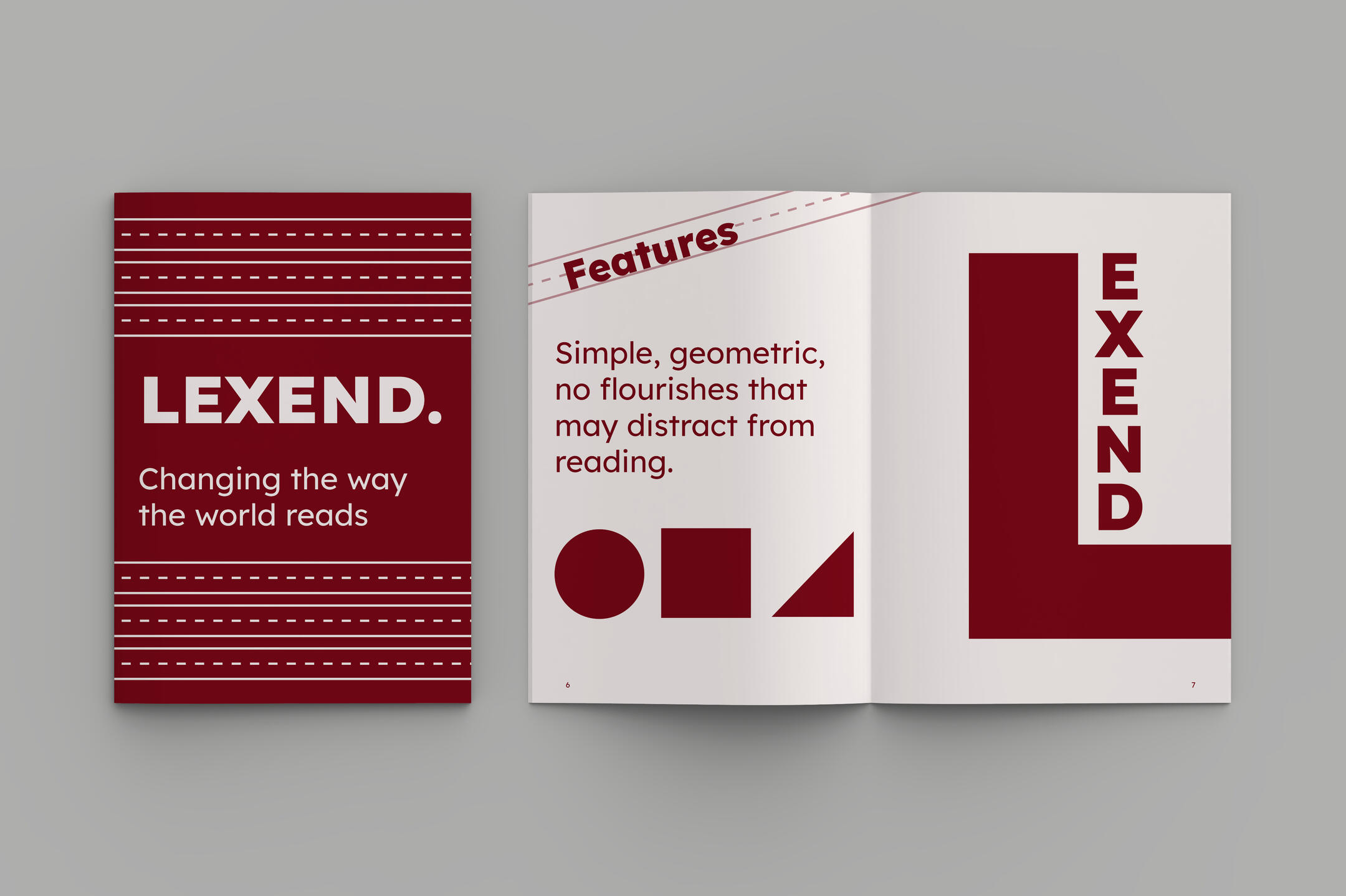
To highlight the typeface’s emphasis on readability and simplicity, I decided on a theme that mimicked one of the first things English-speaking schools teach — how to read and write the alphabet.The booklet incorporates these “guidelines” as the main graphics, in order to showcase the letterforms.
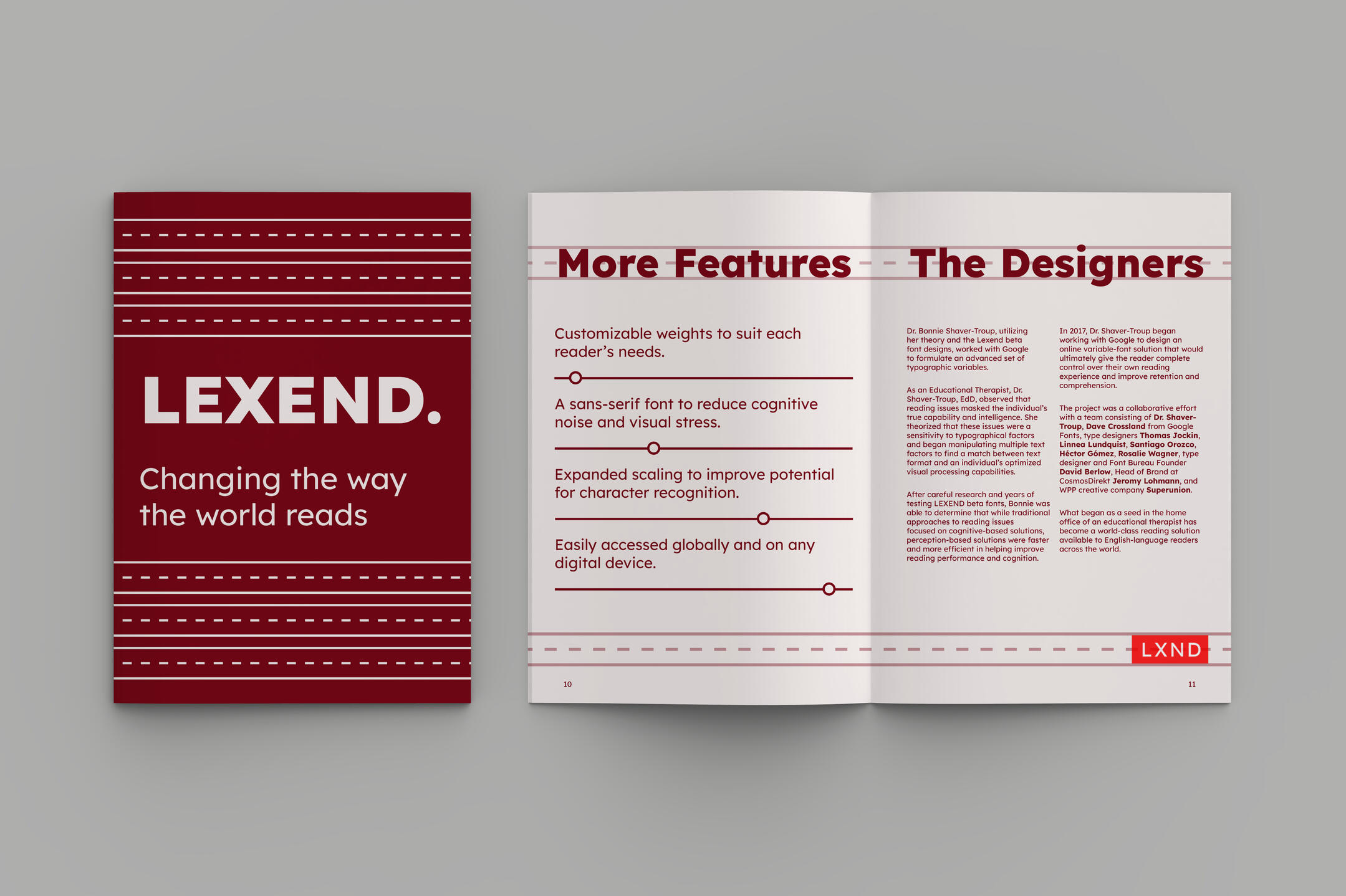
design choices
The typeface’s introductory website and logo use a bright red and white. I wanted to pay homage to it, but darkened the red to create higher colour contrast and added a slightly red tint to the white to make it less harsh on the eyes than pure white.The decision to incoporate minimal graphics was made to allow for there to be more breathing room for the typeface. I used simple shapes to symbolize the geometric nature of the type design.
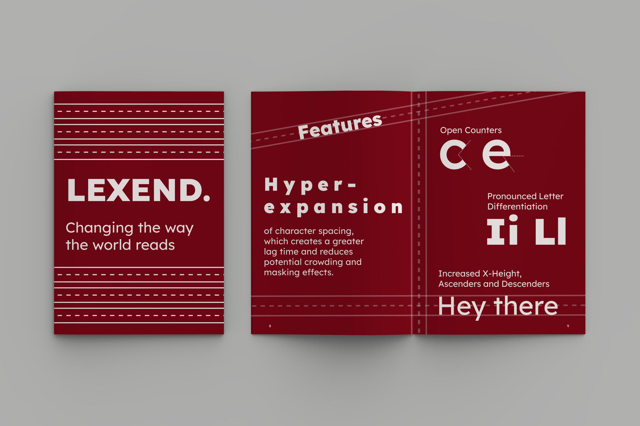
what i learned
This project allowed me to exercise my layout skills and practice preparing designs for print. Considerations of spacing and alignment were critical for this design in order to make sure everything looked right when printing.
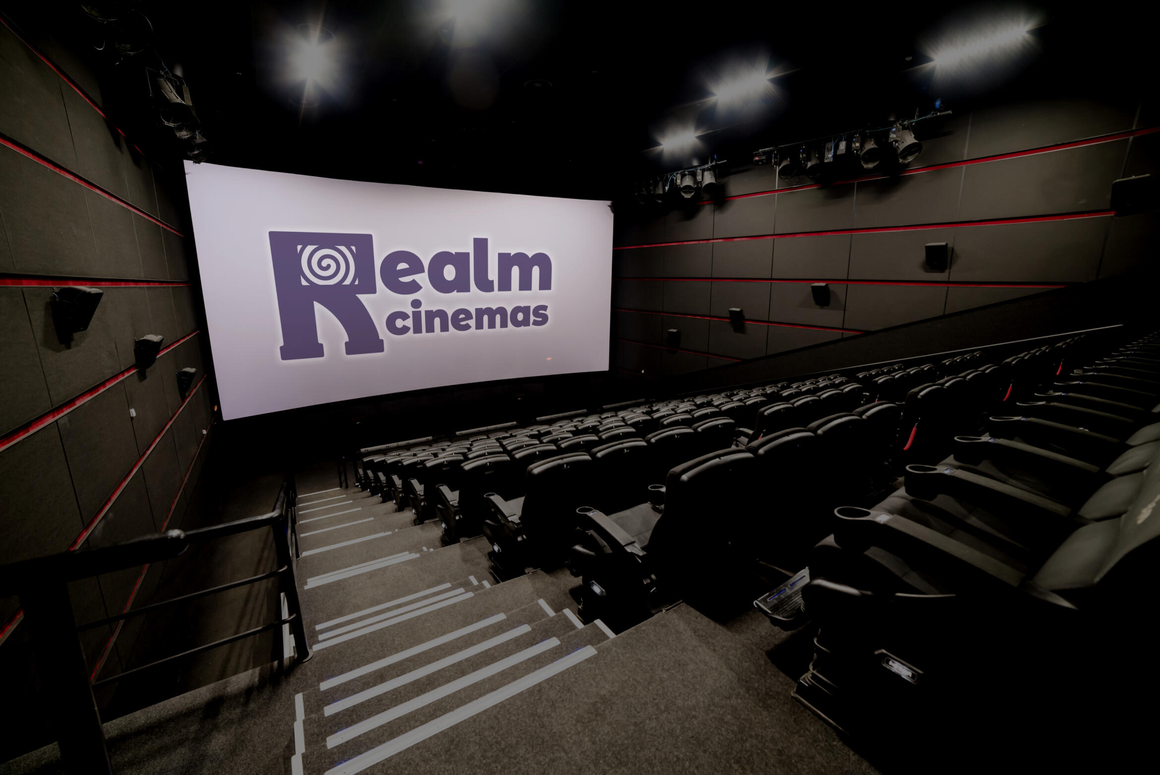
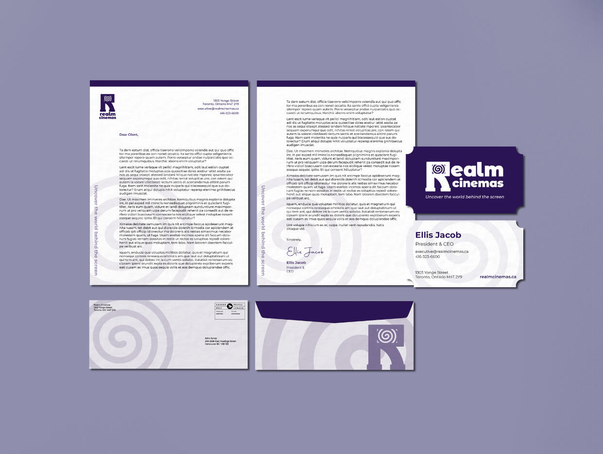
realm cinemas: logo design
By Madeline Liao
A balanced yet playful logo design for a movie theatre company
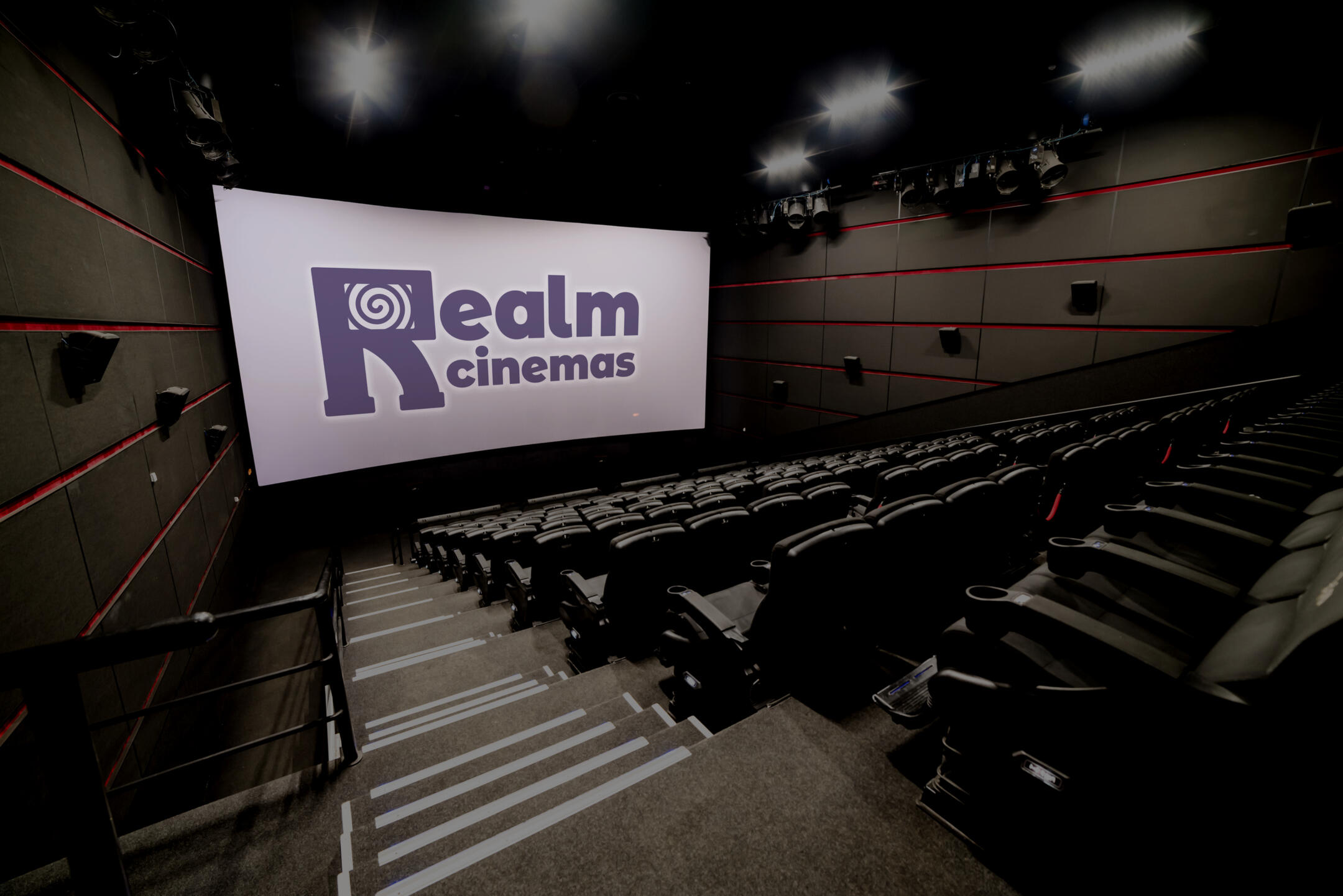
The task for this project was to create a logo design for a cinema company.
The theme this design follows is the idea of transporting to a different universe or “realm”
when going to the cinema. The logo is formed around the ideas of immersiveness and transformation.The design aims to bring more character to the brand, creating an opportunity for more
world-building surrounding the company. The logo utilizes a characterized “R,” which can
provide new opportunities for merchandise and advertisements by building a concept
surrounding this logo.
design choices
A stylized letter R was used as the main image of the logo. This R has a spiral eye within its
counter, which gives it more character and imitates the concept of being pulled into a different
“realm.” Stylized slab serifs were used to create the R’s “feet,” adding to the logo’s personification. In addition, the top half of the R simulates a theatre screen. This subtle design choice helps reinforce the immersive experience the company rebrand is aiming to push.
what i learned
This project gave me the opportunity to practice getting into the branding state of mind and design something from scratch.